Monday, January 29, 2018

Picasso's Analytical Cubism: Identify the Subjects

In the second link below it is mentioned that neither Pablo Picasso nor Georges Braque, the inventors of Cubism, wrote a manifesto explaining and justifying what they had done (unlike other modernist artists and movements). However, others filled this void. A fairly standard classification of types of Cubism calls the period roughly 1910-1912 "Analytical Cubism," wherein the artists used multiple points of view to depict a subject more completely on a flat surface than could traditional single-viewpoint paintings.

A fairly detailed explanation can be found here, and a sophistry-filled one is here.

Not long ago I posted here about cubist portraits and how various artists followed Analytical Cubism to various degrees. The present post looks at that breed of Cubism from a slightly different angle. (Hmm -- I seem to be getting swept up into this multiple perspectives notion.)

My contention is that hard-core Analytical Cubism paintings are constructed (presumably against the artist's intent to more fully reveal the subject) so as to make it impossible (or nearly so) for a naïve viewer to identify the painting's subject. That is, the artist presumably knew what steps he was taking to disassemble the subject into parts seen from different perspectives along with what steps he used to rearrange those parts on the canvas. But that naïve viewer would have little or nothing available to allow him to visually reverse that process.

Which leads to a brief discussion of titles of paintings. Purely abstract paintings don't really need titles because they are fundamentally simply decorations. As for representational art, titles can be avoided for still life paintings. Landscape paintings are something of a gray area. They don't absolutely need titles because a viewer can simply think "Oh, what a lovely mountain scene" or whatever the subject. But it can be useful for some viewers to have a title to identify, in this case, what mountain is depicted. Portraits are similar in that in some respects the viewer doesn't need to know the name of the subject, particularly if the subject was simply a model somewhat arbitrarily chosen by the artist. But where the subject has any degree of notoriety or fame, a title is probably necessary for distant future viewers somewhat ignorant of the milieu at the time the work was painted. (How many people today could recognize an image of Robespierre on sight, famous though he once was.) Similar things might be said regarding historical or religious scenes: to the extent viewers are ignorant of the subject, titles are necessary.

Due to the process of making an Analytical Cubist painting and the difficulty of discerning the subject unaided, titles are essential to provide the viewer with a clue as to how to reverse-engineer the painting. I am not sure how many viewers actually do try to figure out where all those fragments came from, and from which viewpoint. Generally speaking, for practical purposes Analytical Cubist works come very close to being abstract decorations.

Now for some fun. Below are several such paintings by Picasso. I didn't provide title captions. Can you correctly guess that subjects of those paintings that are not familiar to you? I'll post the titles in a comment later in the day this appears, so you'll know.

Gallery


Thursday, January 25, 2018

Seated Couples by Herbert Morton Stoops

Herbert Morton Stoops (1888-1948) wasn't a noted cover artist for the likes of the Saturday Evening Post or Collier's, but thrived in the next rung or two below. A near-contemporary of Harvey Dunn (1884-1952) and Dean Cornwell (1892-1960), his style was similar to their 1920s work. Biographical information can be found here and here.

Stoops was born, raised, and educated in the Mountain West and therefore easily dealt with cowboy-type subjects. As an artillery officer in the Great War he, like Dunn, could convincingly portray scenes of that conflict. And because he lived in New York City from the 1920s onward, he also was capable of illustrating sophisticated urban life.


Here is an illustration combining the wild west and urban sophistication.

While collecting Stoops images from the Internet, I noticed that quite a few lacked rip-roaring action. Instead, they were quiet settings showing seated couples.

Gallery


Well, this one isn't so quiet, but I like the seated woman.

Monday, January 22, 2018

Analytical Cubism Portraits

Wikipedia has this extensive entry dealing with Cubism. Early on, it states:

"Historians have divided the history of Cubism into phases. In one scheme, the first phase of Cubism, known as Analytic Cubism, a phrase coined by Juan Gris a posteriori, was both radical and influential as a short but highly significant art movement between 1910 and 1912 in France. A second phase, Synthetic Cubism, remained vital until around 1919, when the Surrealist movement gained popularity. English art historian Douglas Cooper proposed another scheme, describing three phases of Cubism in his book, The Cubist Epoch." Those were "Early," "High" and "Late" Cubism, and the entry uses that concept to organize its discussion.

The peg I'm using for this post is the Analytical Cubism concept, whereby artists were supposedly presenting a subject by simultaneously using several different points of view in order to show it more completely than traditional art's single viewpoint.

I find it hard to believe the early cubists were serious in this regard. After all, Pablo Picasso (1881-1973), an inventor of Cubism, was something of a prankster.

Consider the hypothetical case of an artist seriously making a Cubist portrait using perhaps half a dozen different perspectives. The result will probably be an image that is so fragmented that only the artist himself would know what segments of his painting or drawing came from which viewpoint. A viewer of the work might be able to identify how a few fragments originated, but would be at a loss to comprehend how the entire work was assembled.

In other words, instead of showing a more complete view of the subject, the result is that even less of the subject is understandable to a viewer than would have been the case for a traditional portrait.

Some examples of early cubist portraits are shown below.

Gallery

Pablo Picasso: Portrait de Daniel-Henry Kahnweiller - 1910
If you didn't already know what art dealer Kahnweiler looked like, could you form an accurate image of him using only the material presented in this "portrait?"

Pablo Picasso: Portrait de Ambroise Vollard - 1910
Here Picasso comes closer to depicting Vollard as others actually would see him.

Pablo Picasso: Girl With a Mandolin - 1910
Not strictly a portrait, as he made no attempt to break the subject's face into many fragments -- he just simplified/abstracted.

Albert Gleizes: Portrait de Jacques Nayral - 1911
Albert Gleizes (1881-1953), background here, besides being a painter, was a cubist theoretician who co-authored the 1912 book "Du Cubisme." He remained a cubist of sorts for much of his career, so unlike Picasso he should have been serious. But the example shown here simply has the subject's face and hands reduced slightly in the direction of faceting. Only other parts of the figure plus the rest of the setting are what most would consider cubist.

Albert Gleizes: Portrait de Mme H. M. Barzun - 1911
The same can be said regarding this portrait.

"Du Cubisme" was co-authored by Jean Metzinger (1883-1956), who I wrote about here. Metzinger was a cubist for a while but later works were far more representational. This painting is largely a matter of using simplified shapes and faceting, though a slight amount of perspective-twisting can be seen.

Jean Metzinger: Portrait de Mme Metzinger - 1911
When it came to portraying his wife, Metzinger fell back to the practice of faceting features and putting cubist decoration in the background as Gleizes did.

What the above gallery suggests is that even committed cubists often had to hold back from a hardline "analytical" approach when making portraits. Perhaps this compromise with purity had to do with the practical matter of portrait subjects wanting to be shown in a largely recognizable manner.

Thursday, January 18, 2018

Some Unfinished Paintings by Pissarro

Camille Pissarro (1830-1903) had a long, prolific career. His Wikipedia entry is extensive.

While I was surfing through collections of his work via the Internet, I came across three unfinished works. I'm not sure how interesting this is for the average reader, but I know that people who paint, along with art historians, usually enjoy stumbling across such items that reveal an artist's technique.

Gallery

Mountain Landscape at Saint Thomas, Antilles - 1854-55
One of Pissarro's earliest surviving works. Painted on his return to Saint Thomas, but quite possibly interrupted when he left again for France. At this stage of his career, Pissarro seems to be finishing a painting area-by-area.

Peasant Woman - 1885
Thirty years later, he is more into assembling his painting on a balanced basis. This seems to be a gouache or watercolor that requires different handling than oils. Nevertheless, he leaves important areas to be finished later.

Poultry Market at Gisors - 1889
Here Pissarro spent his time on the featured foreground subjects. Heads and faces in the distant crowd might or might not receive a bit more detail.  The far side of the market square is was roughed in when he set this painting aside. (Though he did add his initials instead of his usual signature, indicating ... something.)

Monday, January 15, 2018

Edwin Georgi, Famous Illustrator with Minimal Biography


Edwin Georgi (1896-1964) is the subject of a fine new book crammed with his illustrations. I wrote about Georgi's early illustration years here. For more information about the book, you can click here.

One thing that struck me was how limited the biographical part was. For example, no date of death was mentioned. And the text was the same or nearly that of an article in Illustration Magazine's issue No. 30 (Summer, 2010) written by its editor/publisher Dan Zimmer, who also authored the new book. I then grabbed my copy of Masters of American Illustration: 41 Illustrators and How They Worked to see how it treated Georgi. Again, not a lot was said. A brief Google search turned up next to nothing new.

What is reported regarding Georgi is interesting. He attended Princeton and was on the Tigers' football team. When the USA entered the Great War, he became an Army pilot. Like many, he was shot down in those pre-parachute times, but survived the crash only to be hospitalized for a year. He became an illustrator in the 1920s and had a very successful career into the early 1960s. At some unstated point he married and then had children. He owned several houses and continued to fly. And that was about all important biographical information about him that I've been able to find. Zimmer did have contact with family members, but little information about his career and artistic methods seems to have come from them.

So, what to make of this? Maybe Georgi was a very private man. Another possibility, given the large amount of work included in the book, is that he spent much of his time laboring to hit his deadlines and spent the rest of his time as a normal, upper-middle class American in the 1940s and 50s.

Thursday, January 11, 2018

Henry Russell Ballinger: Soirées to Seascapes

Henry Russell Ballinger (1892-1993) lived to be 100 years old and was active into his mid-90s. There is little biographical information about him on the Internet. However, this notes that he "studied at the University of California, San Francisco; the Art Students League with Harvey Dunn; and the Academy Colarossi, Paris." And here is another snippet that mentions he "worked as an illustrator for almost 20 years, doing magazine covers for Yankee Magazine, McCall's magazine and the Saturday Evening Post."

Ballinger was a skilled landscape, seascape and shoreline painter who wrote several books dealing with paintings those subjects (an example is here ). His works are found in several museums.

What is not clear to me from the limited information available is the arc of his career. My best guess is that, since he had training by Dunn, he probably did his illustration work in the 1920s and 30s, then shifted to fine arts. Or maybe he did fine art painting all the while and worked as an illustrator to maintain his income.

There are a few examples of his paintings found in Google searches, but I turned up only one sure example of his illustration work. Perhaps lengthy digging or better use of key words might have located Saturday Evening Post covers, but all I found were random cover images.

All this is too bad, because Ballinger seems to have known his stuff, and I would like to see more of it to be sure of that.

Gallery

The Harbor (Kahala Bay) - 1958

A landscape by Ballinger

Illustration for "The Wolf Chaser"
I don't know what magazine this appeared in, nor the date. My guess as to the latter is 1934 or thereabouts. I base this on the women's hairdos and clothing along with the fact that they are shown with alcoholic drinks (Prohibition was abolished in the USA in March of 1933). The cloisoné style is similar to that used by McClelland Barclay at times during the late 1920s and early 30s (examples are here -- scroll down). Click on the image to enlarge considerably.

Monday, January 8, 2018

Wassily Kandinsky: Parallel Projects, Ca. 1940

Wassily Kandinsky (1866-1944) was a theoretician. Highly educated, around age 30 he was on the verge of becoming a law professor but chucked it and became an artist, an art teacher, and a theoretician of art.

Here are some background links. The Wikipedia entry is long on analysis, but short on biographical information. This site focuses more on biography, and includes the nice feature of having a gallery of his paintings arranged by year. A short biography can be found here.

The older I get, the less trust I put in theories that have to do with humans and their acts. So it seems for art. To me, art is something of a craft, so I have no problem with rules-of-thumb such as "fat over lean" when painting in oils. That sort of thing isn't theory: it's a matter of practice that can be ignored if the painter so chooses. On the other hand, Kandinsky who apparently was always fascinated by color, applied his intellectual skills to the matter of painting, and before many years elapsed concluded that abstraction was what the facts (as he saw them) demanded. He created some of the first-ever abstract paintings a few years before the Great War, and by the war's end he had essentially abandoned representational painting.

Kandinsky is perhaps best known for paintings with lines and geometrical forms distributed on flat backgrounds. But he did more than that. Over his abstract art (or Non-Objective Art -- as the Museum of Modern Art called in in the 1930s) career, he did a good deal of experimentation. Often he would be playing with several themes simultaneously.  In the Gallery below I present part of what he was working on around the year 1940. Also included are works from more distant years using elements of what he was doing around 1940. Kandinsky therefore can be seen to have added and dropped abstract painting styles over his career while usually playing with more than one ideas at any given time -- an evolving set of parallel projects or (for him) intellectual investigations.

Gallery

First, a few paintings he made during 1939-1941. Note the variety.

Untitled - 1941

Red Circle - 1939

Complex-Simple - 1939

Sky Blue - 1940

Next, some paintings using layered or stacked Egyptian-like elements. He did these from time to time over a decade.

Untitled - 1940

Succession - 1935

Sign Series - 1931

Besides geometric forms, Kandinsky also played around with organic blobs. "Fingered" blobs reappear in the paintings below made over another ten-year period.

Brown with Supplement - 1935

Green and Red - 1940

Untitled - 1941

Composition - 1944
One of his last paintings.

Thursday, January 4, 2018

Ramon Tusquets in Catalonia and Italy

Ramon Tusquets i Maignon (1837-1904) came from a well-to-do Barcelona family and became a full-time artist once his father died. Some biographical information is here.

I will assume that Tusquets never had serious financial worries. One piece of evidence in favor of that idea is that he doesn't seem to have relied on portraiture as an income source. Instead, he painted genre scenes in his beloved Italy along with a smattering of other subjects including a few large historical scenes.

Although he was a contemporary of French Impressionists Claude Monet and Pierre-Auguste Renoir as well as the Italian Macchiaioli Giovanni Boldini and Telemaco Signorini, Tusquets tended to paint in a traditional, less painterly styles. As a result, while his works were competently done, few strike me as being noteworthy, and it seems that the art world in general shares that opinion.

Gallery

Burial of Mariano Fortuny - 1874
This has a Macchiaioli feeling to it, so perhaps Tusquets was influenced by them early in his career.
I'd be tempted to call this a sketch, but the artist took care to sign it.

Seeking Shelter - c. 1883

Joan Fiveller davant Ferran d'Antequera - 1885
That's a French title to this example of his historical paintings.

washerwomen
I don't have a formal title to this.

Washing Day

hillside village scene in Italy
Again, I lack a title.

Fishing Boats in Venice
Colorful sails on Venice Lagoon fishing boats made it easy for artists to make interesting paintings. I consider this Tusquets' best.

Monday, January 1, 2018

Some Stations are Terminals

This blog is mostly about painting and illustration. One exception has to do with design, architecture and by extension the urban setting. This post is a bit of a stretch from even those topics, but I think it's okay to have a change of pace occasionally, especially on a holiday.

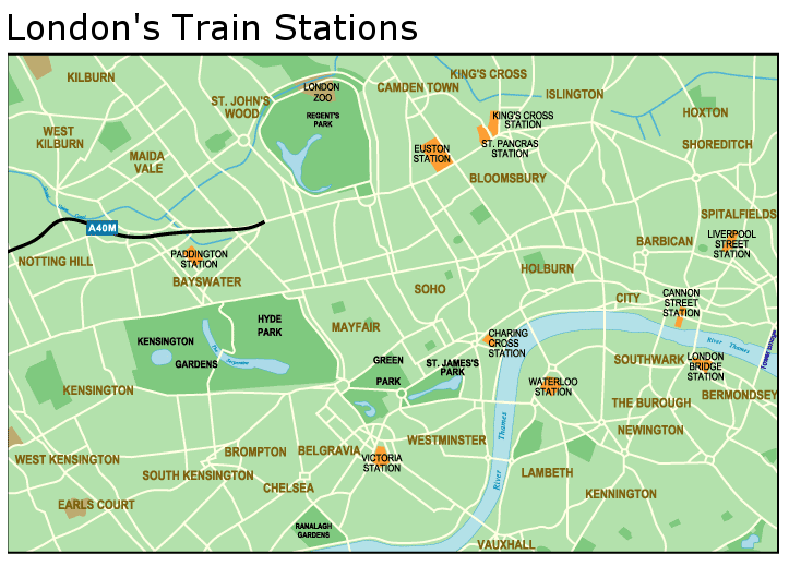
In England, the place where one catches an inter-city railway train is called a station. Some London examples are Paddington Station, Euston Station and Victoria Station. The same is generally true here in the USA -- but not completely. Most people, me usually included, call one such place in New York City Grand Central Station. But its actual name is Grand Central Terminal.

Technically, the place is a terminal because it is the final stopping point or initial starting point for trains. A station, by contrast, is an intermediate point.

Regardless of what they officially or popularly are called, railroad depots that are functionally terminals are relatively rare because the power of railroad systems lies in the fact that they are basically networks where what is carried can flow from place to place. An exception is at a transportation break, typically where a railway spur ends at a ship docking facility for transferring goods from one transportation mode to another.

Another exceptional case is certain large, old, dominant cities that serve as transportation hubs for their countries. In these cases, when railroading started in the 1800s it was already considered too disruptive to carve rail lines across those cities' central areas. Instead, terminals were established at various points around the peripheries of central areas, the rail lines heading away to places in their same general direction from the cities' centers. This is the case for London and Paris.

An alternative is to have a large, central terminal that serves a large number of places, rail lines serving them diverging a ways away from the center. This is approximately how it works in Rome and Milan, though each city does have lesser terminals and stations for commuter lines.

Below are a photo and some maps illustrating some terminals.

Gallery

Seattle Depots - 1913
In the center of the photo is Union Station, actually a terminal used by the Union Pacific and Milwaukee Road lines.  To its right, with the tower, is King Street Station used by the Great Northern and Northern Pacific railroads.  It actually is a station because some tracks head in our direction and reach a tunnel under Seattle's downtown.  You can glimpse those below-street-level tracks if you drop your eyes down from Union Station.

London terminals
They all bear the Station name, but are terminals except for London Bridge Station.  Before the postwar nationalization of railways, each station was associated with a railroad serving its own (but sometimes overlapping) region of Britain.

Paris terminals - 1900
This image featured a peripheral line running just inside Paris' fortifications that approximate the route of the Périphérique, Paris' beltway freeway.  Not all these terminals remain: the D'Orsay is now an art museum, for example.  The functioning intercity terminals are the St. Lazare, Nord, Est, Lyon, Austerlitz, and Montparnasse.

New York - 1909
This map features a subway commuter line connecting parts of Manhattan with New Jersey.  At the upper right is Grand Central Terminal (called "Station" here), and nearby black lines indicate subway and elevated local transportation lines.  Grand Central served the now-defunct New York Central and New Haven lines for many years.  Pennsylvania Station, the other major New York depot, is a true station because some tracks under the station structure connect Pennsylvania Railroad tracks (to the west) to Long Island Railroad tracks (to the east).  The Pennsy also no longer exists but the tracks remain.

Chicago - 1908
I include this map mostly because of the long list of railroads serving Chicago more than a century ago.  Aside from the present government-run Amtrak passenger system (started in 1971) that uses private lines' rails, there never has been a transcontinental railroad company in the United States.  A number of major lines served the eastern part of the county and extended as far west as places such as St. Louis and Chicago.  And there were western railroads serving places as far east as those and a few other cities.  There also were railroads serving the central part of the country, but their tracks did not extend to the east and west coasts.  For someone traveling by train from coast to coast in the heyday of passenger railroading, it was necessary to change railroads in places such as Chicago.

Chicago - 1958
This map shows that downtown Chicago was served by seven terminals (most called Station) in the 1950s.  When I was young, I once arrived in Chicago on the Milwaukee Road at Union Station.  We departed on the New York Central a few days later at La Salle Street Station.  Note that Union Station served the westerly Milwaukee Road and the easterly Pennsylvania Railroad.  But being a terminal, there was no through trackage.  The lines branched a ways out of town.