Thursday, November 28, 2019

Miscellany

Now for an American Thanksgiving Day holiday break from the usual art-related material -- but not a complete one.

I was on a cruise in October that sailed around Italy, taking in a few other nearby locations. I took a number of photos, and thought I'd pass along a few here. Included is a non-cruise one of a location about a mile and a half from where I live.

Gallery

Harry's Bars seem to be everywhere.  This is the one in Rome where I dined once a few years ago.  It's on the Via Vittoria Veneto, the setting of Fellini's La Dolce Vita.  In the background is Rome's wall.

Like Fez in Morocco, Kotor in Montenegro is noted for its stray cats.  Here are a few.

A wall in Koper, the port city for Slovenia.  Seen above on a wall is a commemoration of residents who fought on the Republican (leftist) side in the Spanish Civil War and died there.  At the time, Koper was part of Italy and called Capodistria -- the majority of its population then being Italian.  Since Italy was on the side of Franco's Nationalists in Spain and sent a good many troops there, almost surely there were Esercito Italiano casualties from Capodistria.  But in post- World War 2 communist Yugoslavia when the commemoration was installed, they probably were ignored.

When I was in Valetta, Malta, there were four cruise ships in port.  Above is Republika, the main street, around noontime that day.

A news stand in Salerno, Italy.  Note the calendars for Che Guevara (communist) and Benito Mussolini (fascist).  I can't imagine an American university store having a similar display.

Fantagraphics is a major publisher of reprinted comic strip and comic book content.  Above is their intergalactic headquarters in northeast Seattle.  Technically, this is the house's back side, as the address relates to the street on the opposite side that was altered around 60 years ago when the Interstate 5 freeway was built.  That is, there is a tiny front yard and a front entrance that can't be accessed from the street due to a fence.  Pretty basic, but I suppose these simple digs make a lot of economic sense.  Note the two trash bins.

Monday, November 25, 2019

Willian Russell Flint's Illustrations and Related Work

William Russell Flint (1880-1969) was an honored (knighted by King George VI), highly skilled artist of the representational persuasion. A fairly brief Wikipedia entry is here, but if you would like a lot more information about him, click here.

Should you do an Internet images search on his name, you will discover many pictures of very attractive nude young women. Since there was more to Flint's work than that, this post deals with his book illustrations from around 1910 along with watercolors and other paintings safe for viewing at your office desk.

Gallery

La Belle Dame Sans Merci - 1908

Princess Ida - The Gate yields, Hildebrand and Soldiers rush in - 1909

From "Le Morte D'Arthur" - 1910-1911

From "Le Morte D'Arthur" - 1910-1911

Calypso and Odysseus

Girls Weaving Baskets

Park scene

Tamborine players

The Festival of Santa Eulalia, Andalusia - c. 1932

Carnation - c. 1932

Raquel and Manula

Thursday, November 21, 2019

Bernard Krigstein: Fine Artist and Comic Book Artist

It seems that Bernard Krigstein (1919-1990) was a Fine Arts guy at heart, yet for 15 or so years he illustrated comic books and actually appreciated what he was doing. Some background is here and here.

Before his time -- the late 1940s and the 1950s -- the quality of comic book art was generally mediocre. Perhaps some of that was due to the large number of separate images required for, say, a six-page story. Production speed was and is an important economic concern in that field. But during the 1930s there emerged examples of well done art in newspaper comic strips. Examples include "Tarzan" by Hal Foster and Burne Hogarth, "Terry and the Pirates" by Milton Caniff, and Alex Raymond's "Flash Gordon."

Krigstein and some others upped comic book artistic quality as well as experimented with the means of presentation of sequential events.

His training and inclinations along with clashes with comic book editors and publishers caused him to drift into general illustration and then to teaching art while doing painting on the side.

In comic book / sequential graphic novel world, his work is highly regarded and honored for its quality, innovation and versatility. Some examples are presented below.

Gallery

An illustration from around late 1942 or early 1943 featuring Bell P-39 Airacobras.

Page segment featuring tight, crisp drawing and use of solid black areas.

Lead page of a comics story where Krigstein makes used of bold inking.  (He generally did his own inking, usual for comic books.  I do not know for sure if he inked the images above, however.)  Update: Bill Peckmann informs me that Krigstein did do the inking.

Part of the final page of his epic "Master Race" story.  Here he makes use of a kind of stop-motion, slow motion effect that was used in some 1970s movies and seen fairly frequently in recent years in graphic novels.


This is sheer opinion on my part, but I think all those little pictures slow down the reality of what he is depicting.  A possible alternative would be, following the first image, to have a panel something like my doodle above showing the man slipping and starting to fall onto the subway tracks, and then cutting to the final panel above.  It would be quick, as in reality, and readers could easily fill in the details via imagination.


Krigstein also illustrated a book dealing with baseball.  Here it is necessary to break action down into significant steps.


The first and second pages of "The Flying Machine," set in Japan.  Here Krigstein makes use of simple penwork and designs suggestive of classical Japanese prints.  Note that the uncolored version is much more appealing than the colored appearance found in the comic book.  Innovative for its time, as usual.

Moving on from his comics career, here is a Krigstein pen and wash drawing.

Self-portrait.

Monday, November 18, 2019

Cruise Ship with Retro Décor

Now for a brief shift from graphic art to Industrial Design / Interior Decoration -- subjects I occasionally touch on here.

Aside from two troopship journeys across the Pacific Ocean, I didn't do cruising until I married my late wife. I've been doing it a bit more the last couple of years, though I'm beginning to find cruising not as cost-effective as I'd like. That said, I recently cruised around Italy aboard a ship whose interior design was not what I have come to expect, and I thought I'd pass along a few thoughts and images regarding that.

The ship is MS Pacific Princess, owned by Princess Cruises -- Wikipedia entry here. As the entry notes, it is a relatively small main-line cruiser originally intended for sailing in the South Seas in the area of French possessions. Princess was not the original owner, though has operated it for most of its 20 years.

Gallery

Shown here off Split, Croatia, is the Pacific Princess. In the background is the Grand Princess -- as it happens, it is the only other Princess ship I've sailed on. The Pacific is about 600 feet (180 m) long and currently carries a little fewer than 800 passengers. Its size makes it handy for entering somewhat restricted ports of call. The Grand, on the other hand, is a typical large cruise ship. Its length is about 950 feet (290 m) and can carry around 3100 passengers.

The cruise ships I've sailed on feature interiors of mostly Modernist design. Shown above is the atrium of the new (2018) Holland America cruiser Nieuw Statendam, an extreme example of such décor.

Modernist interiors began to appear by the late 1920s on a few ships. Perhaps the most important example is the French Line's Île de France of 1927. Above is the smoking room in First Class.

Before that, transatlantic liners featured First Class zone interiors similar to those found in men's clubs or luxury hotels. Given the inhospitable character of the North Atlantic for much of the year, such décor helped distract passengers from the sea and provided a sense of familiarly along with expected comforts. Shown above is the smoking room of the RMS Olympic (1911), sister ship of the Titanic.

Smoking room of the SS Statendam (1929). Note the ceiling, as something akin to it will be seen below.

An older ship, the HAPAG SS Oceana of 1890, rebuilt in 1905. Less plush than the later, larger Atlantic liners.

The atrium of the Pacific Princess. I don't know if this was the original décor or if it's the result of a refurbishment. At any rate, the Pacific's public interior spaces featured various pre-1930 steamship interior themes. I found that a little odd when first coming onboard, but soon became used to it.

A passageway with lots of heavy, dark wood.

The library.  More dark wood. The ceiling here and in the atrium echo the sort of thing shown above on the SS Statendam and many other classic liners.

Thursday, November 14, 2019

Robert Brough's Short, Promising Career

Robert Brough (1872-1905) was a Scottish painter whose career was cut short by injuries sustained in a train accident. Some background information is here and here.

He was capable of making fine society portraits in the vein of John Singer Sargent (who was his friend), while also earlier in his career creating boldly painted images where strong brushwork dominated -- perhaps influenced by the Glasgow Boys.

I was unaware of him until I recently encountered two of his works in Venice's Ca' Pesaro museum.


"Twixt Sun and Moon" (1895) as captured by my iPhone. I couldn't find Internet images of this and the following work. Click on this image and the next three to enlarge.

"Twixt Sun and Moon" detail. Note the brushwork.

"St. Anne of Brittany" (1895).

"St. Anne of Brittany" detail.

Now for some images of Robert Brough paintings found on the Internet.

Gallery

Breton Women - c. 1893
He made a number of sketches such as this during his time studying in France. Doubtless the basis for the paintings featured above.

Sweet Violets
A combination of solid and wispy. Similar in spirit to Giovanni Boldini.

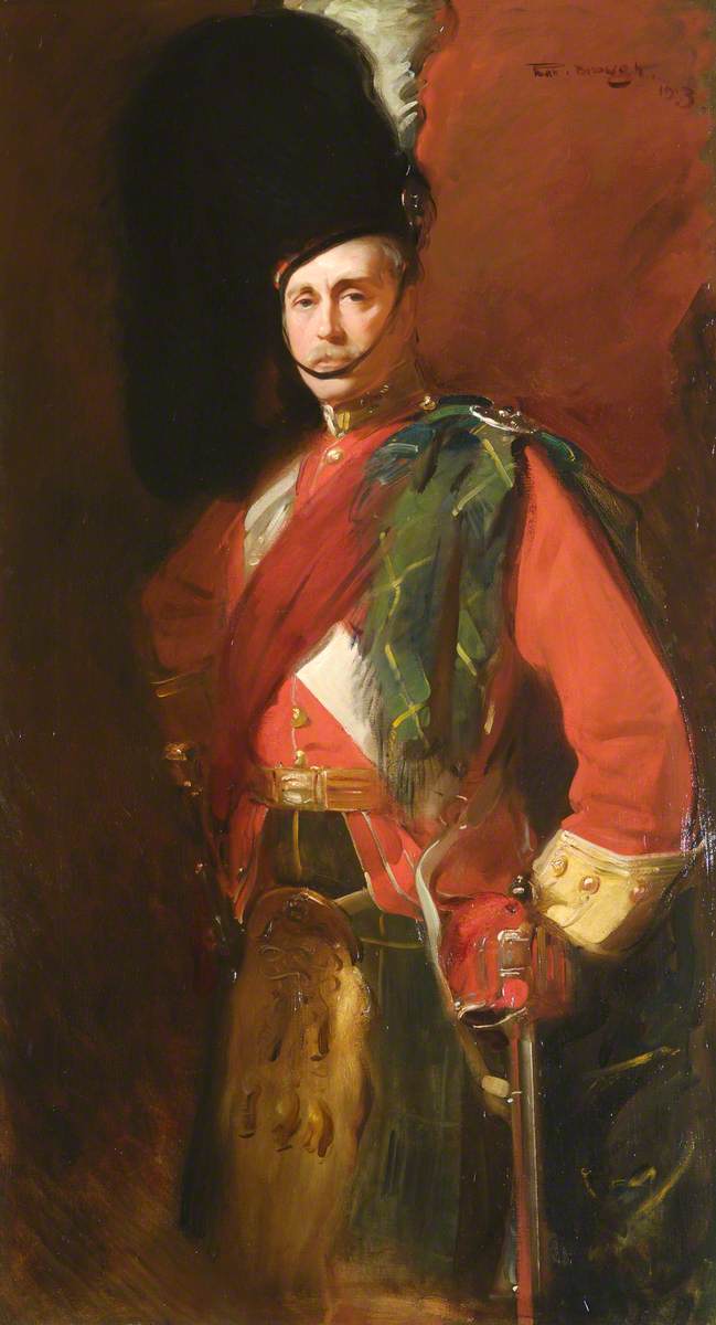
Captain Sir Harry Brooke of Fairley - 1903
Society portrait of a man.

Miss Maude Lawrence - 1898
Society portrait of a woman with a John Singer Sargent touch.

Mrs William Pyper - 1900
Society portrait featuring strong brushwork aside from key features.

Monday, November 11, 2019

Fernand Lungren: Some Eurpean Scenes

Fernand Harvey Lungren (1857-1932) is not well known, but in his day traveled widely and knew many important fellow artists. Places he lived include: New York; Cincinnati, Ohio; London; Santa Fe, New Mexico; California (Los Angeles and Santa Barbara); Paris, and Egypt. For more details, link here.

He worked in oils, gouache, watercolors, pastels and perhaps other media for his illustration work. On the other hand, though his approach was representational, his style varied over time and place, not being recognizably distinctive.

Since his settings were widely spaced -- from Paris cafés to Egyptian pyramids to southwestern American deserts to the California coastline, I limited the images below to scenes he painted in Europe during the first half of his career.

Gallery

The Café - 1882
Perhaps Lungren's best known work -- highly simplified style for its time.  Had he continued painting something like this, he would be remembered better (though might have had trouble selling his works as art fashions evolved).

In the Café - c.1882
A variation on the first image.

Paris Street Scene - 1882
Watercolor of a rainy day.

The Gardens of Luxembourg - c. 1882-84
John Singer Sargent painted a scene this sort.

Piccadilly Spring Morning - 1899
Piccadilly Street, not Piccadilly Circus.

Liverpool, Docking a Liner - 1899
Another atmospheric scene.  He probably entered England at Liverpool on his return to Europe.