As suggested in this post's title, his illustrations do not interest me, let alone excite my imagination. They are hard-edge, have detailed depictions of subjects and settings, but lack a distinctive personal style. Competent, generic illustrations typical of their period.
Take a look at some examples:
Peace on Earth
From the early-to-mid 1930s. The woman is interesting, the man in the background isn't, so far as I am concerned.
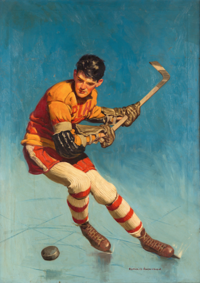
Hockey player - 1935
Nice pose, but I doubt that he will lower his stick in time to strike the puck.
Woman resting - 1935
Her arms seem too small, or maybe her head is too large.
Beer advertisement illustration
Stroh's was a Detroit-based beer.
Doctor's house call
The Nurse's Escorts
A World War 2 image showing a nurse with enlisted men from the navy and army. The swabby has higher rank for some reason. (I'm an ex-Army E-5, so I note such details.)
Home from the Army
One web site says this was a 1951 illustration, but the uniform seems to be from the very early 1940s.
Home from the War
The young man was a tech sergeant in the 5th Army that fought in North Africa and Italy.
Recital scene
This apparently early illustration is the most interesting one I that I could find. I like the composition and brushwork (aside from the rough treatment of the faces and arms).


1 comment:
The Woman Resting has outsize sleeves, making her figure look funny in that posture she is done in.
Post a Comment