Monday, August 31, 2020

Frank Wootton Car Drawings


Frank Wootton (1911-1998) is probably best known here in the USA for his illustrations of aircraft and automobiles.   I wrote about his aircraft paintings here and elsewhere (use the Search tool at the right).  But he was more versatile than that: I wrote about his poster art here.  A brief Wikipedia entry on him is here.

The present post presents some car drawings from his "How to Draw Cars" books.  The cover of "Volume 2" is shown above.  It was published in 1955, but contained essentially the same text as the 1949 version.  The difference was that the 1955 edition had many drawings of more recent cars along with a few from 1949.

Wootton had a very nice way of presenting highlights and reflections on dark, shiny surfaces of automobiles.  The images below are mostly from the 1949 book.

Gallery


Sketches of Rovers from the 1955 book.  Previous images are from 1949.

Thursday, August 27, 2020

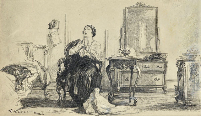
More F.R. Gruger Illustrations

Frederic Rodrigo Gruger (1871–1953) was a popular illustrator in his day who usually worked using pencil, sometimes augmented by washes. I wrote about him here. David Apatoff's take on Gruger is here and James Gurney's is here. And the Society of Illustrators had this to say.

The present post presents more examples of his work for your consideration.

Gallery

This is a fine example of Gruger's watercolor or ink wash work (I haven't seen the original, so am not sure of the medium).  It's an illustration for Edna Ferber's 1926 book "Show Boat."

This Gruger illustration seems to be painted rather than his usual pencil work on cheap cardboard (see Apatoff, above, for more on his techniques).

A magazine story illustration.  In the early decades of the twentieth century most non-cover magazine illustrations were in black and white due to production costs.

Often, those illustrations were of scenes from the story that were not very dramatic -- especially if the story itself dealt with subjects that weren't basically dramatic.

This meant that often illustrations weren't intended to attract the attention of potential readers, instead simply providing an interpretation of what story characters looked like in various settings of the narrative.

This low-action scene by Gruger might be a study rather than a completed illustration.

No washes here.

The lighting is dramatic, but the scene is static. All too many Gruger illustrations, while normally well-done, lack excitement. Was that his intention? Or that of magazine art directors?

Monday, August 24, 2020

Seattle's 1914 Smith Tower -- Tallest in the Western USA

This blog normally features graphic art.  But it's true that Yr. Faithful Blogger has always been interested in architecture, so from time to time that is the subject of a post.

This post deals with Seattle's Smith Tower (L.C. Smith Building) that was completed in 1914.  Its Wikipedia entry is here.

For much of my early life, the Smith Tower was the tallest building in Seattle, tallest in the western USA, and it was a big deal to visit the observation deck and gaze down on the rest of downtown.

If memory serves, the same floor housed the Chinese Room. The Wikipedia entry states: "The Chinese Room, whose name was retired following the 2016 renovation, derived from the carved teak ceiling and blackwood furniture that adorned the room on opening. The room was furnished by the last Empress of China, Cixi. Furnishings include the famous Wishing Chair. The chair incorporates a carved dragon and a phoenix, which, when combined, portends marriage. According to folklore, any wishful unmarried person who sits in it would be married within a year."


The above photo was taken in the Chinese Room at a college fraternity Pledge Dance.  That's me and my date.  I'm not sure if we're seated in the chair just mentioned.  Perhaps not, because we never married one another.

Wikipedia notes that the Smith Tower has 38 floors.  But when I was young, it was claimed to have 42 stories: perhaps that included the beacon at the very top.

Architecturally, the Smith Tower is a blend of 1910 Chicago-style functionalism and historical detailing -- the latter in the form of a campanile style tower top.

Gallery


Early postcard view from Pioneer Square.  Note the "42 Story" claim.

Under-construction view showing completed steelwork.

Partly sheathed.  The building is not rectangular in plan-view.

Photo taken probably not long after completion.

Seattle skyline from around 1937.  The Smith building towers over the rest of the city, rivaled only by the Northern Life Tower at the left of the image.

Seattle skyline view taken by me in June 2019.  The Smith Tower is that tiny thing at the right of the photo.

Thursday, August 20, 2020

Charles Wysocki: If Grandma Moses had Attended the Art Center School

Charles Wysocki (1928-2002) trained as an illustrator in the early 1950s at the (then) Art Center School in Los Angeles. At the height of his career he was well-known for painting country and village scenes in a faux-naïve/primitive style, many of which were used as the artwork for jigsaw puzzles. His Wikipedia entry is here.

He was surely aware of the paintings of Grandma Moses (1860-1961), famed for her untutored scenes of the northeastern New York State of her early years that fetch hundred of thousands of dollars at auction. As the title of this post suggests, Wysock's works might be considered what Moses might have painted had she an Art Center education.

Below are examples from both artists -- first Grandma Moses, then Wysocki.

Gallery

Over the River to Grandma's House - 1943
She painted many winter scenes.  Having spent four winter in the nearby Albany area, I can attest that four or five months of the year were snow-covered where she lived.

County Fair - 1950
A summertime scene.  Her ability to depict perspective was limited, so structures often appear flat. On the other hand, she does incorporate distance in most of her works.  Also, compare the inconsistent sizes of the people in the foreground, middle ground and background.

Yankee Wink Hollow
Now for Wysocki.  His scenes often contain distant backgrounds like Moses' works.  Buildings have a flattened appearance. Note here the small foreground houses, the larger middle ground objects and the small background objects -- much like what Grandma Moses did with people in the previous image.

Churchyard Christmas
Winter scene. As in the previous image, the background trees are stylized/geometrical in the same spirit as 1930s Regionalist paintings by the likes of Grant Wood.

Pete's Gambling Hall
Buildings are flattened, creating  design elements.

Twas the Night Before Christmas
This is more representational because correct perspective is incorporated in most structures.

Victorian Street
A very flat painting/design.

The Nantucket
Seashore, not countyside.

Olde Bucks County
This is stylized, but more representational than the images above. Unfortunately, I do not know if this was made before or later than the others.

Monday, August 17, 2020

Leo Putz -- Women's Faces in Detail

Leo Putz (1869-1940) was an Austrian painter who used interesting brushwork during one phase of his career -- about 1903-1912. That involved distinct brushstrokes often from what appears to have been square-tipped brushes.

His Wikipedia entry is here. I wrote about him here.

The present post presents a few examples of that brushwork style applied to faces of women. I hope you find these images interesting.

Gallery

Frieda Blell - Am Ufer detail - 1909
Putz married Frieda around this time. He idealized her face here: it actually was more narrow.

Gusti Bennat - Dame in Blau detail - 1908
Gusti modeled for him several times.

Gusti Benannt - 1908
A portrait of Gusti.

Sommerträme detail (model unknown) - 1907
From one of Putz's best-known paintings.

Thursday, August 13, 2020

Mikhail Vrubel's Demon Series

Mikhail Vrubel (1856-1910) was an interesting Russian painter active in the late 19th century who I wrote about here.  I stated: "[He] began to work on images of a demon based on an epic poem by Mikhail Lermontov.  His first Demon painting in 1890 was noteworthy enough to launch his career."  Vroubel's lengthy Wikipedia entry is here.

The present post presents images from the Demon series that I found on the internet.  Having viewed many of the paintings in Russia several years ago, I can assure you that they are large and quite impressive when seen in person.  That said, some of the images below can be enlarged by clicking on them, though the impact is nothing like that of the real things.

Gallery

Head of a Demon (drawing) - c. 1890

Head of a Demon - 1890

Head of a Demon - c. 1890
Various Internet sites present this in different color schemes, so I don't know what the original colors were.

Flying Demon - 1899

The Demon Downcast - 1902
Wikipedia link here.

Seated Demon - 1890
Probably Vrubel's most famous Demon painting.  Wikipedia entry here.

Monday, August 10, 2020

Harry Anderson's Illustration Work

Joseph Harry Anderson (1906-1996) was a highly competent illustrator who is not well known despite the high regard he had (and has) among a number of practicing illustrators and illustration fans.

His Wikipedia entry is here, information about his painting technique is here (scroll down), and a website devoted to him is here.

After many years as a commercial illustrator, Harry Anderson largely switched to making large religion-themed paintings for the Seventh-Day Adventist and Church of Jesus Christ of Latter-Day Saints (Mormon) organizations. I focus on his commercial work here.

His illustration style was characterized by smoothly flowing transitions of shapes and colors, though his religious works and some commercial illustrations were more hard-edge. An interesting fact is that he was allergic to oil paints and had to switch to water based alternatives including gouache and casein.

Gallery

This is perhaps my most favorite Anderson illustration. Note the contre-jour depiction of the girl with its coloring and use of highlighted areas -- impressive.

Off to School
Again, note Anderson's use of highlights on the hair of his three main subjects. The man in the background is washed-out so as not to detract.

Story illustration from source unknown to me. From the early-to-mid 1940s to judge by the women's hairdos. Everything other than the featured couple is casually, sketchily painted. Nice, warm color scheme.

From Cosmopolitan Magazine - 1941
His depiction of light and shaded areas is skillful indeed.

From Good Housekeeping Magazine - 1943

From Ladies' Home Journal - 1950
The composition is in line with emerging American illustration fashion at that time.

Coronado's Men Find the Grand Canyon
Now for a hard-edge scene: I don't know the source.

Esso gasoline illustration - c. 1965
Also more in a hard-edge vein. The setting appears to be the Pebble Beach golf links by Carmel, California in the late 1920s.

Going into the Sun
Finally, Western subject matter. Again, sharper subjects and painterly background.