The Chicago fair opened after most of the pre-Depression Art Deco and Moderne office towers had come on line and little was being built. To a considerable degree the thrust of the trend towards architectural modernism had been halted. Its evolution had effectively ceased aside from doodles in architects' sketchbooks. The New York fair came later in the architectural drought at a time when the Depression was easing, but few large buildings aside from government structures were being built. At least it created an opportunity to look ahead while entertaining fair attendees.
By the early 1960s when the 1964-1965 fair was being planned, the "future" that the '39 fair attempted to predict had already happened in the form of a modernistic building boom in New York City and elsewhere. Rather than featuring Progress or The Future, this fair's weak theme was "Peace Through Understanding." As best I could tell, it was virtually invisible to fairgoers, there being no pavilions from major nations due to the fair's lack of BIE sanctioning.
Nevertheless, the fair's architects and designers did their best to show off, and a number of pavilions were future-oriented in what was on display. So the fair's architecture ranged from attempts at showing the future to whimsical structures to even traditional or historical recreations.
The fair was not a great success. And it did not excite me when I visited it in June of 1965 during the second and last year of its run. Information regarding it can be found here.
Below are some photos I took.
To set the scene, this is the General Motors pavilion at the 1933 Chicago Century of Progress exposition. It seems more Moderne than Deco.
And there is GM's 1939 New York pavilion as seen from the rear. I suppose the style might be called Streamline Moderne.
Now it's 1965 and this is part of the Chrysler Corporation area. That's a whimsical V-8 motor sculpture at the left.
Here is the nondescript, government-issue bureaucratic architecture United States pavilion.
The theme symbol was the Unisphere. A giant cliché that might well have been selected by an unimaginative committee. It still exists.
More whimsy: The Tower of the Four Winds. Some of its elements moved when caught by a breeze or wind, in the spirit of Alexander Calder.
The Rheingold brewery opted for a traditional setting. Its beer had been very popular in New York for decades, but was starting to fade in the mid-1960s.
And there was the Belgian Village that hadn't been finished when the fair opened in 1964. It was best known for its Belgian waffles.
The New York State pavilion. Its best feature was observation towers, two of which can be seen at the left. The nice thing about the towers wasn't their design. Rather, once you were up one, there was a good view of the fairgrounds -- especially in the evening when the major pavilions were illuminated.
New York State observation towers as seen from farther away.
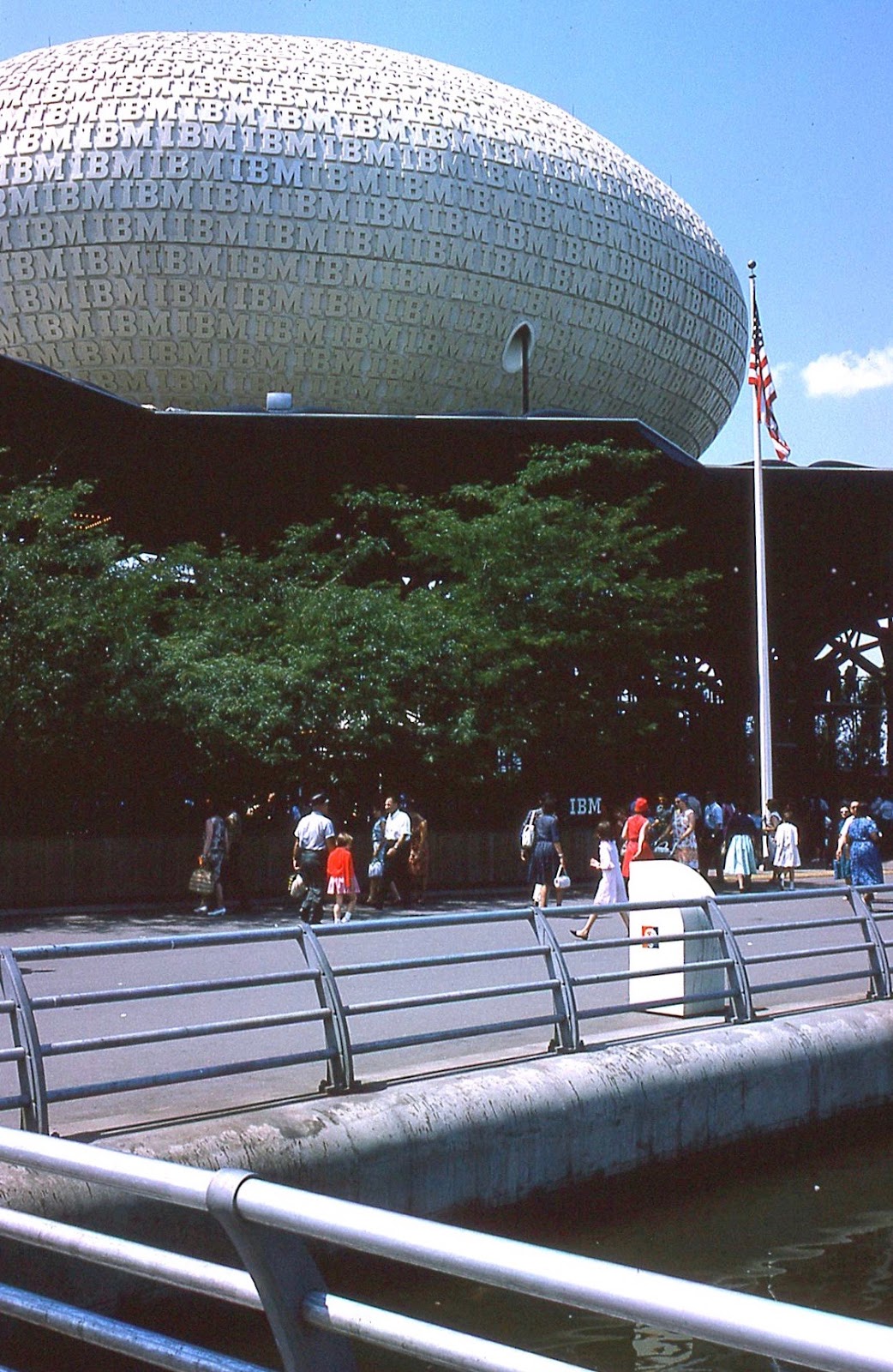
The IBM pavilion.
This is the AT&T Bell Telephone pavilion. It features a "floating" look that reminds me of Star Wars type spacecraft that appeared nearly 15 years after it was designed.
The General Electric pavilion.
The General Electric pavilion at night.
The Unisphere and pool at night.


No comments:
Post a Comment