His English language Wikipedia entry is skimpy, so consider linking here to his French entry.
As can be seen in the images below, Ham chose to exaggerate shapes of cars and planes when they were depicted in action. However, he was capable of more representational depiction when he so chose.
For what little it's worth, I am not a big fan of the sketchy, exaggerated French style of illustration seen from the 1930s into the 1950s and even beyond. I think that Walter Gotschke, who I wrote about here, did a better job of depicting racing cars impressionistically.
First, three examples of Ham's poster work at the height of his career -- for the Monaco Grand Prix race.
The cars are exaggerated, but recognizable. The same applies to the backgrounds.
This is a 1932 illustration of a Hotchkiss participating in the Monte Carlo Rally (wherein cars drove from various points in Europe to the finish line in the principality). It is more realistically depicted, though its perspective is still exaggerated. Image via Christie's.
A 1939 poster study. This shows that Ham could be accurate when the spirit moved him.
Bugatti Type 35 racer. Here exaggeration is minimal.
Géo Ham even made some illustrations of other subjects. This is of a restaurant at the 1937 Paris exhibition.
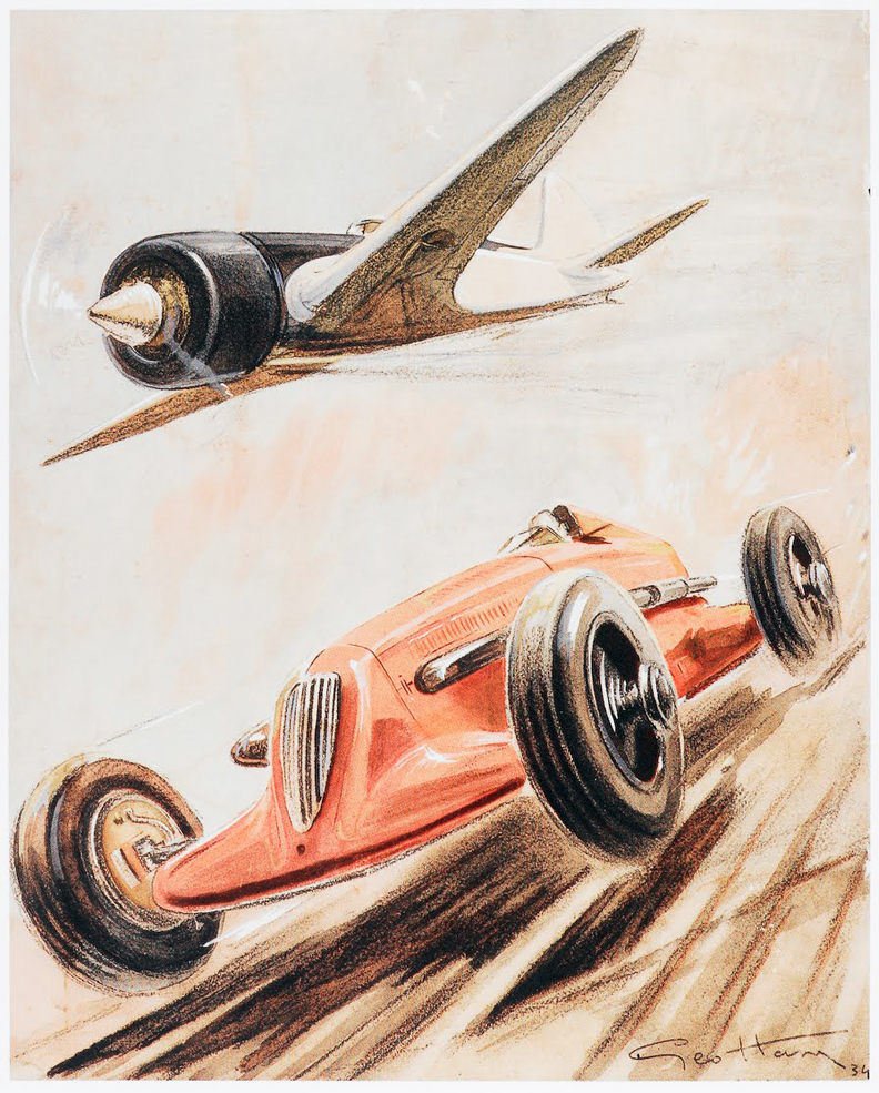
Showing a 1934 race between a car and an airplane. I'm away from my reference material, so as best I can tell, both are Ham's inventions.
He also made magazine cover illustrations. This highly distorted car seems to be a design he invented so as not to favor any existing brand.
In addition to posters and magazine covers, Ham illustrated advertisements for several French automobile companies.
Finally, a postwar example of his work, this featuring the 1954 24-hour Le Mans race. Image via Heritage Auctions.


1 comment:
I was at the London Motor Show in 1996, there was an auction upstairs, run by "Brooks" I think, a fancy affair with some incredible vehicles and other automobile related items, including the entire studio of Geo Ham. Hundreds of artworks, enormous original posters, hundreds of med size original artworks in folios bulging. Prices were modest, unfortunately I knew what I was seeing but just didn't have the money to buy. I've regretted not buy to this day.
Post a Comment