I recently
wrote about some of Bob Peak's poster art, and need to expand on the subject. A regular reader pointed out in a comment that movie posters are large, so some of my quibbles regarding small, subsidiary images as seen on a computer screen (or, Heaven help, a smart phone) are not based on a fair way to judge.
That is correct. And I then began to think about the nature of movie posters, something I hadn't done before, given that I am only a tepid film fan.
Most mainline movies feature actors and actresses who are known to significant numbers of the potential audience. They are called "stars." Therefore, to entice viewers of a new film, publicity often (usually?) features those stars.
So it is with movie posters. In Peak's day and for three or more decades before, movie posters prominently displayed illustrations featuring the film's leading cast. That was an important factor in the design, though not absolutely essential. Once a theme regarding emphasis was established, the illustrator (along with the studio's marketing and publicity people) might add other visual details and certainly consider alternative poster layouts.
Below is an early Peak poster preceded by some posters for important movies in the years before in order to provide a little context for Peak's achievement. I do not identify the illustrators of those other posters because I didn't bother to research so thoroughly. Also bear in mind that a successful film would likely be given a number of alternative poster designs and themes, so the ones shown here are not necessarily the original or definitive versions. But they are suggestive of the genre of the 1950s and early 1960s.
Gallery
Singin' in the Rain - 1952
Kelly was the big star, O'Connor was known as a supporting actor and Reynolds was new. Apparently more was thought needed than only Gene Kelly's face, so all three were featured. That said, this poster didn't give much of a clue as to what the movies was about. Perhaps that it was an MGM musical was all the publicity folks needed.
The King and I - 1956
Posters often came in different formats for the same film. This is an extreme vertical example that used elements found in more conventionally shaped alternatives.
Cat on a Hot Tin Roof - 1958
The famous Elizabeth Taylor is featured to the visual exclusion of others.
Gigi - 1958
This design is more "arty" than most for those days.
North by Northwest - 1959
Probably not the original design, but this does show how a major star could be featured. A dramatic element in the film is included.
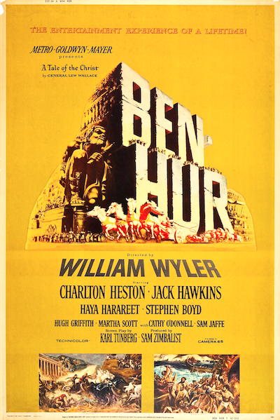
Ben-Hur - 1959
This was not the first Ben-Hur film, as it and another were based on a well-known book. Perhaps for that reason, stars were not featured in the illustration -- only the famous chariot race in the main image.
Lawrence of Arabia - 1962
Several important actors were in this film, and they are in the small images. As with Ben-Hur, the name "Lawrence of Arabia" was known to the general public and therefore featured.
Cleopatra - 1963
Three famous stars, so all get the same visual billing.
My Fair Lady - 1964 (French poster)
Peak was an excellent, style-setting illustrator at this time. But he too followed (had to?) the convention os featuring the main stars while including visual bits from the film.
My Fair Lady - 1964 (art)
Peak's art that was used in various ways to publicize the movie.


