Monday, August 16, 2021

Stefan Prohaczka's Dieselpunk Source Materiał

Stefan Prohaczka is highly regarded for his Dieselpunk digital art by fans of that genre.  Unfortunately, I could find no biographical information about him via Google other than he is (or was) based in Paris.

What I find interesting about his work is that it's often easy to spot his source material.  Not necessarily the exact image he used as part of the basis for an illustration.  Just the source subject itself.  Since Dieselpunk is a kind of alternative history, the use of thinly-disguised subjects can be justified.

Below are some examples, some of which I am personally familiar with ... for what little that might be worth.  Image titles are either from various websites or are my descriptive ones.  Click on images to enlarge.

Gallery

Eurocentric Airlines
A steam-powered transport aircraft that couldn't possibly fly.  But who cares?

The Ferry Boat Kalakala
The Kalakala was operated in Puget Sound on the Seattle-Bremerton run by the Black Ball line.  I never rode it, but saw it many times when I was young.

Diesel City 7
A Noir train station scene.

General Motors Electromotive publicity
Although details varied over the years, Prohaczka's locomotive is clearly a GM diesel.

Dramatic scene
P-51 fighter planes, searchlights, what appear to be statues, and ...

1964-65 New York World's Fair Unisphere - via NY Times
I attended the fair in 1965.

AeroStream Cruiser
Another unflyable device.

General Motors Aerotrain - Robby Gregg photo
Prohaczka's image is of the Aerotrain locomotive.  I rode the Aerotrain from Chicago to Detroit in 1956.

Blimp Airlines
That's a dirigible, not a soft blimp.

Early Zeppelin
But the source is clearly a circa-1910 Zeppelin such as this one.

Pilot and Skyscapers
A wartime scene.  The large building in the background is ...

Waldorf-Astoria Hotel in 1935
I've stayed there a few times.

Trans-Europa Express
Poster design.

20th Century Limited locomotive in 1939 - Daniel Hagerman photo
Industrial designer Henry Dreyfuss designed the cladding for this iconic New York Central locomotive.

Monday, August 9, 2021

Molti Ritratti: Judith

According to this Wikipedia entry, the Biblical book of Judith is not accepted by all Judeo-Christian faiths: her story might have been an invention.

Regardless, it's a great story that's had much appeal to artists for many centuries.  Beauty, sex and blood (the Jewish widow Judith slicing off the head of Holofernes, an Assyrian general) is almost irresistible subject matter that happens to be validated in the Roman Catholic Bible.

Many painting were made of that event, and a sampling is presented below in chronological order.

Gallery

By Giorgione - Giuditta con la testa di Oloferne - c.1504
Here she seems calm, perhaps satisfied with her work.

By Lucas Cranach the Elder - c.1530
Holofernes is rather gruesome, but Judith is well-dressed and without a trace of spattered blood.

By Caravaggio - "Judith Beheading Holofernes" - 1598–1599
I regard this as the most satisfying depiction from a psychological standpoint: note her expression as well as his.

By Cristofano Allori - "Judith with the Head of Holofernes" - 1613
As mostly usual, no sign of spilled blood.

By Gentileschi Artemisia - "Judith Slaying Holofernes" - 1614–18
This is bloody and perhaps inspired by Caravaggio's painting.  It's also likely the most realistic depiction of an actual event of that kind.

By Augist Riedel - 1840
Holofernes is absent here.

By Charles Landelle - 1887
Here too.

By Gustav Klimt - 1901
Painted during Klimt's gold-leaf decorative phase, and almost as famous as Caravaggio's work.

By Georges-Antoine Rochegrosse - 1905
This shows Judith on her way to dispose of Holofernes.

By Gustav Klimt - 1909
Another fascinating Klimt painting.  I made this photo in Venice, where it reposes in the Ca' Pesaro museum.

Monday, August 2, 2021

"Form Follows Function" In Automobile Design?

For more than a century a secular religion strongly held by many architects and designers is the idea that "form follows function," as mentioned in this link to Wikipedia.

The dean of the University of Washington architecture school, Arthur Herrman, was my instructor for a class on architectural history.  He was seriously hard-core when it came to form and function along with being true to one's building materials.  The following year I took first-year Architectural Design, where one student was gently, but firmly, told that his non-modernist apartment design was verbotten territory so far as the School of Architecture was concerned.

At that time I had been reading early books by American industrial designers (I was an ID major then). The goal of making designs where form was shaped by function was mentioned along with the need to streamline and simplify products.

I'm sure that this carried over to early automobile stylists, a number of whom had architectural backgrounds or had read some of those industrial design books.  Though I need to add that I am pretty sure most stylists then and later tended to not practice "form follows function" to the nth degree.

That said, not long ago a Fiat stylist proclained himself a follower of the religion. The above Wikipedia link includes the following quote:

"If the design of an automobile conforms to its function—for instance the Fiat Multipla's shape, which is partly due to the desire to sit six people in two rows—then its form is said to follow its function." -- Fiat Multipla designer Roberto Giolito, via Automotive News Europe 19 July 2019 (link here).

I posted about my dislike of the Fiat Multipla design here.  Even if Giolito was correct in his statement (which I dispute to some degree), the result was not attractive.

But enough theorizing: The present post presents examples of designs that are fairly pure followers of the dictum.

Gallery

Gestetner duplicating machine - c.1929
The redesign of this device was important in launching Raymond Loewy's career as an industrial designer.  This is what a pre-Loewy machine looked like.

Gestetner duplicating machine - c.1930
And this is Loewy's version.  The functional parts are hidden by cladding that simplifies the appearance.  The main purely "functional" benefits are: (1) the machine is easier to operate, and (2) less dust will collect on the mechanisms, making it easier to maintain.

1926 Essex Coach
Now for automobile design.  Essex began making closed-body sedans of this style for the 1922 model year.  The car shown has a functional exterior design in that the main components are clearly seen: passenger compartment, doors and windows, radiator, headlights, bumper, fenders, running board.  However, the design seems awkward in terms of proportions -- especially the short hood that functionally houses a short, inline four cylinder motor.

1930 Packard Standard Eight Sedan
A luxury car of similar vintage.  Its functionality is of the same ilk as the Essex's.

1930 Packard Standard Eight Sedan
Note the separate trunk.  Three are some decorative moldings below the windows that are non-functional in mechanical or layout terms.

1930c Audi Type T "Dresden"
The same can be said for this European design from the country that hosted the avant-garde Bauhaus design school.

1933 Tatra 77 prototype
Another function is aerodynamic streamlining which is related to fuel consumption efficiency.  For this function to dominate, components such as were mentioned with regard to the Essex are now merged  into a wind tunnel tested envelope shape.  Here the front fenders are not well integrated and the hood seems too stubby.  But the car is fairly attractive.

1939 Horch 930 S Stromlinie
The front fenders of this Horch are better integrated than those on the Tatra above.  However, the passenger compartment seems out of place.  That might be because it is functional in terms of passenger access, headroom and outside visibility -- not so functional in terms of streamlining.

1949 Nash
An American example of streamlining in the early post- World War 2 years.  The simple, slab sides cover what would have been wheel openings.  This streamlining contradicted the functional needs of easily accessing the tires and of a better turning radius.  The overall design seems too heavy looking.

1952 Saab 92
Saabs at the time were made by an aircraft company, so the body was wind tunnel tested.  This early Saab is attractive seen from this angle, though the back window seems to be placed too low.  Also, there is no trunk lid, making access quite inconvenient.  Two functional demerits there.

1951 Gutbrod Superior
Now for some designs that emphasize simplicity such as Loewy promoted.  The Gutbrod was a very small, inexpensive car.  Small cars can't carry much decoration, and the only decorative elements seen here are the simple grille bars and the nose crest.  All told, a fairly attractive design.

1952 Škoda 1200
This Škoda is larger than the Gutbrod, yet also has minimal decoration.  Although the exterior shapes are simple, they strike me as being awkwardly proportioned.

1947 Kaiser Special - Mecum Auction photo
A post- World War 2 design from an essentially new carmaker.

1947 Kaiser Special - Mecum Auction photo
Again, simplicity of forms is stressed, but like the later Škoda, the overall effect appears awkward.  Simplicity itself does not seem to guarantee aesthetic success.

1957 Imperial Southampton Coupe
Another function of an automobile's design is being salable.  That usually means that a car's looks are in tune with current design fashions and the functions discussed above are sublimated to marketing prowess.  The 1957 Imperial is shown here because this design let to the brand's greatest production volume year in its history.

1957 Imperial Southampton Coupe
Another view of this successful (in marketing terms) design.

Cross-posted at Car Style Critic

Monday, July 26, 2021

Georges Rochegrosse: Not Always an Orientalist

Le Chevalier aux fleurs - 1884
The painting shown above is by Georges-Antoine Rochegrosse (1858-1938) -- Wikipedia entry here.   It's perhaps his most famous work because it is huge and was hung in Paris' popular Musée d'Orsay the last few times I visited there.  According to the museum's Web site, it shows Wagner's Parsifal while on his quest:

"Rochegrosse depicts the moment when Parsifal, the chaste hero destined to find the Holy Grail, has just struck down the guardians of the castle of the magician Klingsor.  He moves away into the enchanted garden, deaf to the calls of the flower maidens, femmes fatales scantily clad in narcissi, peonies, roses, irises, tulips, violets and hydrangeas."

That Wagnerian subject aside, Rochegrosse is often considered an Orientalist.  Scenes of  North Africa and the Near East were popular in the late 19th century, and as best I can tell, the majority of artists painting those subjects were French.  That might be because France's colonial empire included Algeria, Tunisia and (later) Morocco whereas England only had strong influence in Egypt and Germany's colonies were in central and southern Africa.

Although Rochegrosse painted many such scenes and lived in Algeria for a number of years, he also painted non-Oriental subjects.  The images below sample both aspects of his career.  Click on them and the one above to enlarge.

Gallery

The Arab Guard - 1890
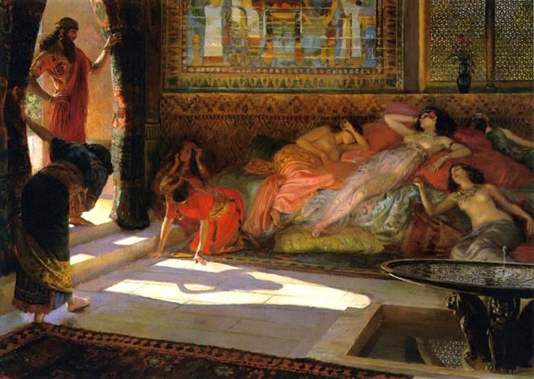
An Oriental scene that includes several partly-clothed beautiful women.  Rochegrosse painted many pictures featuring the same.  They can be easily found in images searches by Google, Bing, and other such Internet sites.

The Queen of Assyria - 1932
A late painting that might be classified as historical-Orientalist.

Arrival of the Queen of Sheeba
Another of the same ilk.

Orientale - 1892

Salammbô
She was the fictional daughter of the Carthaginian general Hamilcar Barca, father of Hannibal -- and the subject of a sensational 1862 novel by Flaubert.

Salammbô - 1910

Marie Rochegrosse dans la salle à manger de Djenan Meryem - 1904
Rochegrosse's wife in the dining room of a North African friend of his.

Sarah Bernhardt in Costume
This is one of two paintings he made of her.

La France en Afrique, dit aussi La Conquête de l'Afrique - 1899
The caption roughly translates as "France in Africa, also called The Conquest of Africa."  Politically incorrect today, but true to its time.  The style is considerably different from Rochegrosse's usual -- it's flatter, with Impressionist and poster touches.  Examination of an image found in a book I have about Rochegrosse suggests the subject at the far left resembles a Tonkinese from French Indochina.

Les Héros de Marathon - 1911
An historical scene of Greeks defeating the Persians.  Its lighting reminds me of that in the painting of Parsifal.