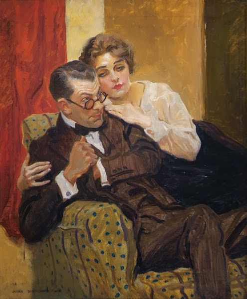
A brief Wikipedia biography is here, but more useful sources are here (for details) and here, where you can scroll to view examples of his work.
I am ambivalent regarding Flagg's art. That might be because it's a little too loose and too stylized for me. Let me elaborate. The looseness could drift towards a lack of control. As for stylization, his faces sometimes came off more Flagg-like than how peoples actually appeared. I'll point out examples below. On the other hand, he was quite capable of "nailing it," and I'll point that out too.
Army recruiting poster - 1917
This is by far Flagg's most famous work: iconic to this day.
Illustration for Judge magazine cover, 31 March 1917
Flagg could paint in oils, but that was done mostly when he wasn't illustrating.
Pen and ink illustration
Much of Flagg's illustration work was for magazine interiors, rather than covers. Before the 1920s, he often used pen-and-ink, as did many other illustrators at that time. (This illustration seems to be from the 30s, however, so he continued to use a pen when he could get away with it.)
Wash or watercolor illustration - 1930s
By the 1920s and 30s, he had largely switched to water media. The girl is nicely done, but the Rolls-Royce in the background is far too sketchily done (inaccurately drawn) to suit me.
In Liberty Magazine - 27 October 1934
But here Flagg shines. Not the whole illustration, but with the seated women. Especially the expression on her face.
Sketch of actress Jean Harlow
This is an example of Flagg-style taking over bits of portraiture. Yes, it looks like Harlow. And yes, there's no mistaking who drew her.
"Lost Horizon" poster - 1937
More Flagg intrusion, especially his treatment of the subjects' noses and the general sketchiness that detracts from what many people expect from a movie poster. Flagg's treatment of Ronald Colman's right shoulder is just plain wrong.


2 comments:
"Flagg's most famous work: iconic to this day." And a rip-off of the Lord Kitchener one used on a magazine cover.
http://www.campaignlive.co.uk/news/1282279/
dearieme -- True, but nevertheless, the image remains iconic here in the Colonies.
Post a Comment