Wednesday, July 30, 2014

John E. Sheridan: Conventionally Competent

John E. Sheridan (1880-1948) is yet another illustrator I've been writing about lately who had a reasonably successful career, yet is little remembered. And like so many other technically competent artists I've dealt with here, lasting fame was elusive because what was missing was a distinctive style.

Sheridan's Wikipedia entry is here, and a more lenghthy biography that stresses his fashion illustration is here.

The "reasonably successful career" evaluation I made above is based on the fact that Sheridan painted about a dozen covers for the Saturday Evening Post, the dominant general-interest magazine in America during the first six decades of the last century. Becoming a Post cover artist was truly the Big Time for an Illustrator. And yet ...

Gallery

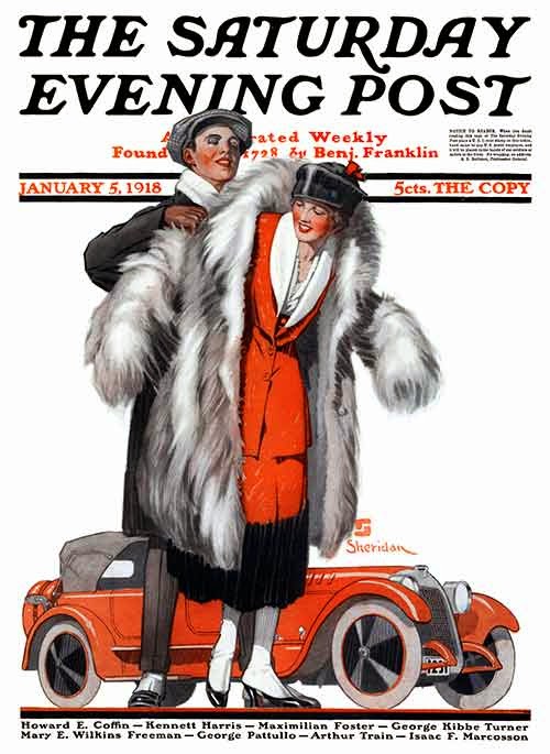
This is a Sheridan Post cover. The United States was in the process of a crash mobilization for the Great War at the time it appeared, but one would never guess that from the cover's subject matter. Interesting car, however: note the slanted radiator which is more evocative of 1932 than 1918.

One of Sheridan's efforts featuring men's suits by Hart Schaffner & Marx, a leading clothing firm for much of the 20th century.

Cover for the May, 1931 American Magazine. American was a second-tier magazine in those days, and Sheridan's illustration has no "story" to it whatsoever.

Also from the early 1930s, though I don't know whether it was for an advertisement or a magazine cover. Once again, a bland, generic subject. It's quite possible that art directors, and not Sheridan, were responsible for subject selection on this and the preceding image.

I really like this movie advertisement or poster. Try to ignore the blue reversed headline type bleeding through that nifty chorus girl. Here we find zing, not blandness. Perhaps Sheridan's reputation would have been better had he been commissioned to paint more of these than the sort of things shown above.
Monday, July 28, 2014

Violet Shading in Circa-1930 Illustration

I'll leave it to art history scholars to tease out the various "firsts" related to this post. Instead, I'll just offer some approximations. For instance, if the French Impressionists didn't originate the concept that shaded areas on objects might be colored violet or purple, they surely popularized it.

I haven't fully researched its use in illustration, but Impressionism-influenced illustrator N.C. Wyeth was including small touches of violet shading on characters he was painting by around 1920 and Harrison Fisher might have been doing the same occasionally a few years earlier.

But it wasn't until well into the 1920s that American illustrators made bold use of violet as a shade hue. Perhaps the influence here was the popularity of toned-down colors on contemporary murals where opposites (in color-wheels terms) were either mixed or placed side-by-side Divisionist-style. At any rate, a warm-shifted approximate opposite to sunlit flesh color (that is, an orange) would be some sort of violet. Examples presented in the present post cover the period 1928-1934 when this color fashion was at its height. Actually, it wasn't much of a fashion, as only a few illustrators participated.

Perhaps the most famous was McClelland Barclay (1891-1943), who used violet shading in some illustrations he made for a General Motors' Fisher Body advertising series. Least-known was Karl Godwin (1893-1962), who I wrote about here. His big-time career period was in the late 1920s and early 30s, though he continued to work at the margins, as indicated here. Finally, there is Walter Baumhofer (1904-1987), whose career began with "pulp" magazines and later transitioned to "slicks." I wrote about him here. Other sources of information are here and here. But if you are really interested in Baumhofer and his work, consider getting a copy of this issue of Illustration Magazine, which is devoted entirely to him.

Gallery

Barclay - Fisher Body ad art - December, 1928

Barclay - Fisher Body advertisement - July, 1930

Godwin - From a 1929 Hudson automobile advertisement


Godwin - Ethyl advertisements - 1932

Baumhofer - Magazine cover - March, 1929

Baumhofer - magazine cover - May-June, 1931

Baumhofer - Doc Savage Magazine cover - July, 1933

Baumhofer - Doc Savage Magazine cover - February, 1934

Baumhofer - Doc Savage Magazine cover art - May, 1934

Baumhofer - Doc Savage Magazine cover - September, 1934
Baumhofer made the greatest use of violet shading, and that was mostly for some of the cover art he created for Doc Savage Magazine. One reason for this is that Dec was described in the stories as having a bronze complexion, and some sort of violet or blue would be the opposite of that dominant color. The cover shown immediately above is my favorite.

Friday, July 25, 2014

Dieselpunk Airplanes

I'm sort of a sucker for the 1920s and 1930s. Call it a "false nostalgia" thing. For that reason, I've developed a peculiar semi-fascination with Dieselpunk imagery where actual 'tween-wars art, machines, architecture and so forth are dumped into parallel universes or alternative histories and thereby transformed.

Wikipedia deals with Dieselpunk here. A more extensive introduction can be found here at the Dieselpunks Encyclopedia.  And a few Web sites for further immersion in Dieselpunk are here, here and here.

Like most other things, Dieselpunk objects can be fascinating or ridiculous or something between. As for which, that depends on the eyes and background of the beholder. Just for fun, let's take a peek at Dieselpunk aircraft.

Gallery

Flying boat, by Tyler West

Vigil at War
I don't have a name for the artist, but wish I did because it's a realistically imaginative image.

Skycrawlers
Again, I don't know the name of the designer.

"Red Baron" by Ajdin Durakovic

Chaparral float plane by Inago
This looks too nose-heavy to actually fly.

Heavy Attacker, by Inago
This illustration has airbrushing that looks very 1938. The airplane itself strikes me as pretty silly.

Fictional Airships by "linseed"

Joint Defense Fighter by "donaguirre"


British flying aircraft carriers and fighter planes of 1939
These are from the 2004 movie Sky Captain and the World of Tomorrow, which I haven't seen, but probably should have for the purposes of this post.

Sky Captain - Manta fighter by "linseed"
The Manta also seems too nose-heavy to fly.

Wednesday, July 23, 2014

Tim Huhn's Retro-Deco Art

There is little personal information about Tim Huhn on the Internet. His own Website has this biographical snippet, and an art gallery site tells us this.

Essentially, Huhn comes from up here in the Seattle area, was trained in California, worked in illustration for a number of years in the Los Angeles area, dropped that and moved to the central California coast, and finally relocated back here.

As for his art, Huhn strikes me as being extremely versatile and able to "sell" his concepts very well. For example, he convincingly painted a number of images in 1930s Moderne style. These poster and mural-like paintings look as if they actually were made in those days. Very impressive. More recently, he seems to have shifted to traditional subjects and technique -- again in a skillful manner. Interestingly, his Web site contains no 1930s iconography; too bad, because he was good at it.

Gallery

Dawn of a New Age


The five images immediately above are posters derived from some Huhn paintings apparently in cooperation with the Just Looking Gallery in San Luis Obispo, California that deals in his art.


Posters of the four seasons.

In Repose
The Just Looking Gallery site indicates that this is a recent work by Huhn.  Still in Moderne mode.

Colonnade at Tolosa (in San Luis Obispo)

Biltmore Tower (the hotel in Montecito, California, near Santa Barbara)

Quartermaster Harbor Morning (on Vashon Island, Washington)
These last three paintings show Huhn working in a traditional mode.

Monday, July 21, 2014

L Fellows: Car Tires and Men's Fashion Illustration

Laurence Fellows (1885-1964), who signed his illustrations "L. Fellows," had an important role in the commercial art of the 1920s, 30s and into the 1940s. I know this because I saw plenty of his work in Art Directors Club of New York annuals and other collections of illustrations from that era.

Only one photo of Fellows has appeared on the Internet, and I could find virtually no information regarding his personal life. On the other hand, useful information about his career and works can be found here, here and (by illustration authority Walt Reed) here.

Fellows had a clean, spare style that observers believe he picked up while studying in France. This was used from around 1915 through the 1920s, especially for a series of advertisement illustrations he made for Kelly-Springfield tires. In the early 30s Fellows took up fashion illustration for expensive lines of men's clothing. During the 1930s he adjusted his style from thin outlines and generally flat surfaces to a more traditional watercolor style in response to changing illustration fashions. Also bear in mind that the proper goal of fashion illustration is to make garments "stars" of the show; this is why texture and pattern dominate Fellows' images here. In spite of these influences, Fellows' work remained distinctive.

Gallery

Kelly-Springfield tire ad illustration from around 1920 (give or take five years).

Perhaps a detail from another Kelly-Springfield ad, ca. 1926.

Couple at ship railing, 1920s.

Formal attire on an Art Deco / Moderne barstool, 1934

Couples dancing, formal attire, 1934

Greeting a woman, 1934.

College students chatting up coed in roadster, 1937.

Man not helping women exit automobile, 1936.

Polo club outdoor lounge lizards, around 1936.

Glaring shoe shine customer, 1935.

Fashionable attire and red sports car, London, 1938.

Perhaps a New York Easter Parade scene, 1941.